A well-crafted style guide is the backbone of consistent, memorable experiences—across marketing, product, and engineering teams.
Whether you’re launching a brand, scaling content operations, or building a design system, a clear style guide reduces friction, speeds decisions, and protects brand equity.
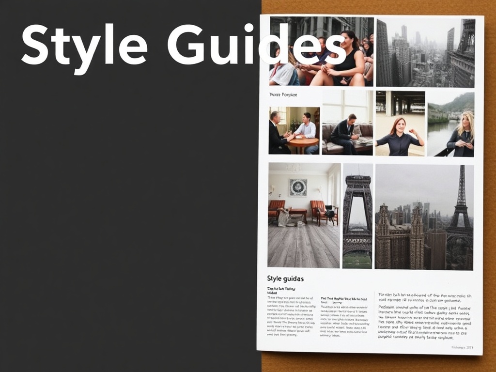
What a modern style guide covers
– Brand voice and tone: Define the personality behind your copy. Describe the voice (e.g., confident but approachable), list tonal variations for different channels (social vs. help center), and include “do” and “don’t” examples to make abstract guidance actionable.
– Editorial rules: Cover grammar choices, punctuation preferences, capitalization, abbreviations, and citation style.
Include a searchable glossary of product names, trademarks, and preferred phrasing.
– Inclusive language: Provide specific guidance on avoiding biased or exclusionary terms. Offer substitutes and explain why certain words should be avoided to help writers make better choices on the fly.
– Design tokens and visual system: Document colors, typography, spacing, iconography, and grid rules. Include color-contrast minimums and accessible font-size recommendations to align visual design with accessibility standards.
– Component library and code patterns: Link UI components to implementation examples (HTML/CSS/React/Vue). Use a living documentation approach so code snippets and design previews stay synchronized.
– Content strategy and formats: Define templates for common content types—landing pages, FAQs, emails, product descriptions—so content producers follow consistent structure and SEO best practices.
– Governance and workflows: Explain who approves changes, how to propose updates, and versioning rules. Make it easy to contribute so the guide evolves rather than stagnates.
Why living style guides matter
Static PDFs quickly become outdated. A living style guide—hosted in a collaborative platform or integrated into design and development tools—ensures changes propagate across teams.
When design tokens feed code, and editorial examples live alongside components, adoption becomes natural rather than optional.
Accessibility and inclusivity as priorities
Accessibility must be baked into every section.
That means accessible color contrast, keyboard navigable interactive patterns, clear alt-text guidance, and plain-language recommendations. Inclusive language guidelines should be specific, offering direct replacements and contextual examples rather than vague admonitions.
Practical adoption tips
– Start with an audit: Collect existing assets, common mistakes, and frequently asked questions from teams.
– Prioritize high-impact areas: Focus first on website templates, product copy, and key UI components.
– Make it searchable and bite-sized: Short, scannable rules are more likely to be followed than long essays.
Use examples liberally.
– Embed the guide where people work: Integrate with design tools, CMSs, and code repositories to reduce context switching.
– Measure adoption: Track content consistency issues, reduced review times, and faster onboarding as success signals.
Quick checklist to launch or improve a style guide
– Define voice and tone with examples
– Create an editorial lexicon for names and terms
– Document visual tokens and accessibility thresholds
– Link design components to live code
– Establish contribution and approval workflows
– Train teams with workshops and onboarding guides
A thoughtful style guide is both an operational tool and a cultural asset. When teams share a single source of truth—covering voice, visual identity, accessibility, and technical implementation—the result is clearer communication, faster production, and a more cohesive brand experience. Start small, keep it living, and prioritize clarity over perfection.