A single, well-maintained style guide is one of the most efficient ways to keep content and design consistent across channels. Whether it’s an editorial manual for blog posts, a brand guide for marketing, or a developer-focused design system, a clear style guide saves time, reduces friction, and increases trust with readers and customers.
Why a style guide matters
Consistency breeds credibility. When tone, punctuation, capitalization, and visual elements follow shared rules, users experience a unified brand. That reduces cognitive load, speeds up content creation, and minimizes editing cycles. For product teams, a style guide accelerates onboarding and prevents debates over microcopy, UI labels, and accessibility details.
Core elements every style guide should include
– Voice and tone: Define the brand’s personality (e.g., helpful, confident, conversational) and offer examples showing how tone shifts by channel or situation. Include do/don’t comparisons.
– Grammar and mechanics: Rules for serial commas, hyphenation, capitalization, numbers, dates, and trademark usage. Be explicit about exceptions.
– Terminology and naming conventions: Approved product names, industry terms, preferred spellings, and forbidden jargon. Include a short glossary.
– Headings and microcopy: Guidance for H1–H3 patterns, button labels, error messages, and CTAs. Show real examples and alternatives that perform well.
– Accessibility and inclusive language: Standards for alt text, color contrast, keyboard focus, readable font sizes, and guidance on bias-free phrasing.
– SEO and metadata: Best practices for title tags, meta descriptions, URL structure, header hierarchy, image filenames, and keyword use without keyword stuffing.
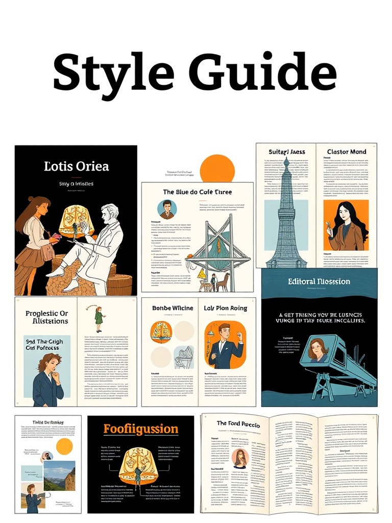
– Visual and brand assets: Logo usage, clearspace, color palette, typography, imagery style, and templates for social posts and presentations.
– Code and component rules (for design systems): Naming conventions, component behavior, responsive breakpoints, and snippets for implementation.
Making a style guide usable
A guide only helps when people can actually use it. Keep rules short, concrete, and example-driven. Use searchable formats, modular sections, and a clear table of contents. Host the guide where teams already work—integrate with CMS, design tools, or the developer repo so it’s part of workflows rather than a separate PDF that collects dust.
Governance and maintenance
Treat a style guide as a living document. Assign an owner or editorial board, set lightweight review cycles, and record a changelog for updates.
Encourage contributions via a simple request process and prioritize updates that remove confusion or fix frequent errors. Regular audits of live content reveal gaps and help evolve the guide pragmatically.
Practical tips to get started
– Audit: Analyze a sample of existing content to identify common inconsistencies and recurring mistakes.
– Prioritize: Start with the highest-impact areas—headlines, CTAs, key product names, and accessibility basics.
– Provide examples: Show side-by-side good/bad examples and annotated screenshots.
– Make it searchable: Tag entries for quick access and include a one-page quick reference for busy contributors.
– Train: Run short workshops or create microlearning modules to onboard writers, designers, and developers.
A thoughtful, well-maintained style guide keeps teams aligned and content effective. By focusing on clarity, usability, and governance, you turn a set of rules into a practical tool that improves brand perception, product quality, and team efficiency.