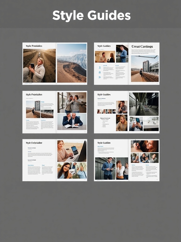
A style guide is the single source of truth that keeps brand voice, visual identity, and user experience aligned across every channel. Organizations that treat style guides as living systems — not static PDFs — see immediate gains in consistency, speed, and quality of content and design.
What a modern style guide covers
– Voice and tone: Clear rules for brand personality, audience targeting, and situational tone shifts (e.g., onboarding vs. error messages). Include short examples showing dos and don’ts so writers can quickly adopt the voice.
– Grammar and usage: Decisions on punctuation, capitalization, hyphenation, numerals, and preferred spellings. A concise glossary of branded terms and forbidden words prevents messy variations.
– Microcopy and UX writing: Guidelines for buttons, form fields, error messages, and notifications. Emphasize plain language, helpfulness, and accessibility in every snippet.
– Visual identity: Rules for logos, clear space, color palettes, typography, iconography, and imagery.
Provide downloadable assets and ready-to-use templates for common layouts.
– Design tokens and components: Bridge design and development with tokens for colors, spacing, and typographic scales plus a component library that maps to code implementations.
– Accessibility and inclusivity: Contrast ratios, heading structures, keyboard navigation, alt text best practices, and guidance on inclusive language and representation.
– Localization and internationalization: How to handle translatable strings, cultural sensitivities, length allowances, and number/date formatting.
Why a living style guide matters
Static guides get out of date fast. A living style guide lives online, integrates with design files and component libraries, and has a clear governance workflow for proposing and approving changes. This approach reduces rework, streamlines onboarding for new hires, and ensures every customer touchpoint feels intentional and consistent.
Practical steps to build a useful guide
1. Audit existing assets: Collect common content types, visual elements, and code components to understand inconsistencies and reuse opportunities.
2. Prioritize high-impact areas: Start with critical flows such as signup, checkout, and help content where consistency most affects conversion and support load.
3.
Document with examples: Show short, contextual examples for each rule. Examples make adoption faster and reduce interpretation errors.
4. Connect design and development: Use tokens and a component library so designers and engineers use the same building blocks.
5. Make it searchable and accessible: Host the guide on a platform with search, version history, and easy navigation. Offer training sessions and quick-reference cheatsheets.
6. Establish governance: Define who can propose changes, how decisions are made, and how updates are communicated to teams.
Tips for long-term maintenance
– Keep rules concise and focused on decision-making, not exhaustive citations.
– Include “why” for non-obvious rules so teams understand the rationale.
– Use analytics and feedback to identify pain points and content that needs refinement.
– Run periodic audits of content and components to ensure the guide reflects real usage.
– Provide templates and starter kits to lower friction for creators.
A thoughtfully designed style guide is a strategic asset. It elevates brand perception, speeds up production, cuts localization costs, and improves accessibility. Treat it as a living document, integrate it into daily workflows, and prioritize examples and governance to make consistent, delightful experiences easier for everyone who creates for your brand.